Web Design 101 – 6/8
This series of lessons is part of our “Build a Better Site” course. Learn how to improve your Wix skills and your website. Enhance your website, grow your business!
In this video, get some tips for impressive web design. You don’t need to be a graphic or web designer to create an impressive website. Use this class as a resource to help guide you in your customization process, to make your website look and feel as good as it can. You’ll learn basic web design concepts and principles, to make the best design decisions for your site.
Sign up for WixEd at http://www.wixeducation.com to get downloadables for this lesson.
Also, subscribe to our channel here: https://goo.gl/d0VmxW
TRANSCRIPTION:
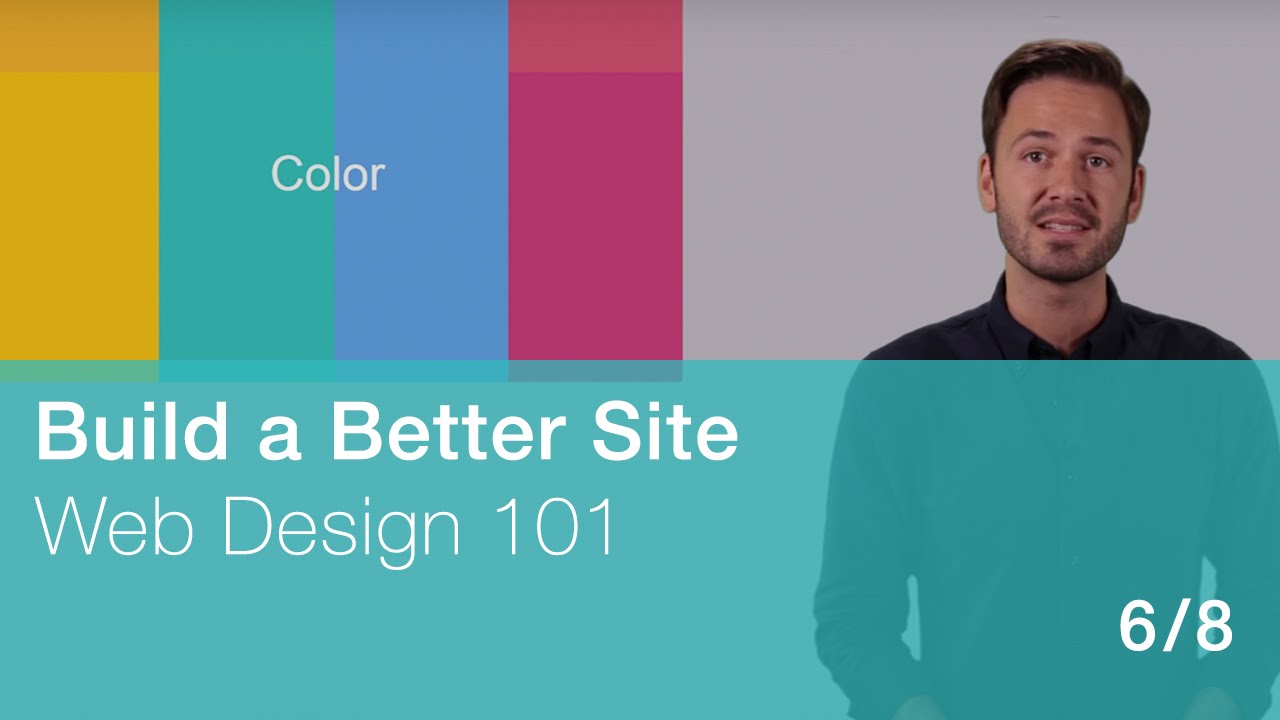
In this video, I’ll focus on specific elements of web design like Color and Typography, with some rules of thumb for each.
Then, I’ll show how the latest trends in technology and design can be used to provide that extra “Wow” factor.
All of this help you create an impressive, memorable experience for website visitors.
Color on a site can make a huge statement about the brand itself – and can have a powerful impact on site visitors. Different colors are associated with different emotions and even values.
For example, blue is typically used on business and corporate-style websites. It symbolizes cooperation and has a calm sense to it.
Pink is a “warm” color mainly used by brands in the fashion and beauty industries. In many cultures, pink is associated with love.
Green is associated with things that are natural and organic. It is also traditionally associated with health, growth, and money! It’s a popular color for websites promoting spas, nonprofits, holistic healing services, and companies with environmental awareness as a core value.
Here are a few tips for choosing color schemes:
Use a color picker tool to help! Choose a color scheme that works with your logo if you have one, as well as your business category, brand values and even “mood”.
Next, decide what color the background will be – if you’ll keep it white for a super crisp, fresh look, or a pop of color for a bolder statement.
Stick to just 1 or 2 “main colors” and 1 or 2 “accent colors” to establish a consistent look throughout the site.
For more on colors and their associations, see our Resource File.
Choosing good fonts is also important for your site’s user-friendliness. This area of web design is known as “typography”, which has a rich history of its own, and there are designers who specialize in creating original fonts.
Your font choices should be made with careful consideration of your site visitors:
First, stick with the most popular “web fonts” to be sure they will appear the same across all devices and browsers.
Choose clear, easy-to-read fonts and avoid anything too decorative like script – especially for body text. You have a little more room to play around with the font of your logo and main messaging – but when in doubt, simplicity rules the roost.
Consider choosing a combination of 2 to 3 fonts instead of just one. Use one for your button text, one for headers and another for body copy. The contrast can be pleasing to the eye and can add a nice touch to the site’s design.
That said – stick to only 2-3 fonts. Again, consistency equals comfort!
When it comes to your site’s typography, comfort trumps creativity. Don’t use fonts as an opportunity to show your artistic side unless you’re really serious about it. If visitors can’t easily read your text, you’re doing yourself a disservice.
Now I want to discuss the importance of “staying fresh”. We live in fast times – and especially in the online world, things are changing and improving at a rapid pace. Just like there’s a new app or social network everyone’s talking about, there are new kinds of web design and user experiences. Here are a few tips on “staying fresh” with the latest and greatest in modern web design:
First – mobile matters! Providing a great experience for visitors to your website from mobile phones and tablets is no longer a “nice to have” feature; it’s a “must have”.
Have you ever visited a really awesome company website…on your phone? It’s a pretty cool discovery when you land on a website that feels like it was built specifically for mobile use. Otherwise, you have to zoom in to read the text, the images take forever to load, and forms just don’t work. You could actually be losing business due to a poor website experience for mobile users.
To see more, please visit this class here: http://user.wixeducation.com/?/enroll/40/#/inside/40/237/1129