Web Design 101 – 3/8
This series of lessons is part of our “Build a Better Site” course. Learn how to improve your Wix skills and your website. Enhance your website, grow your business!
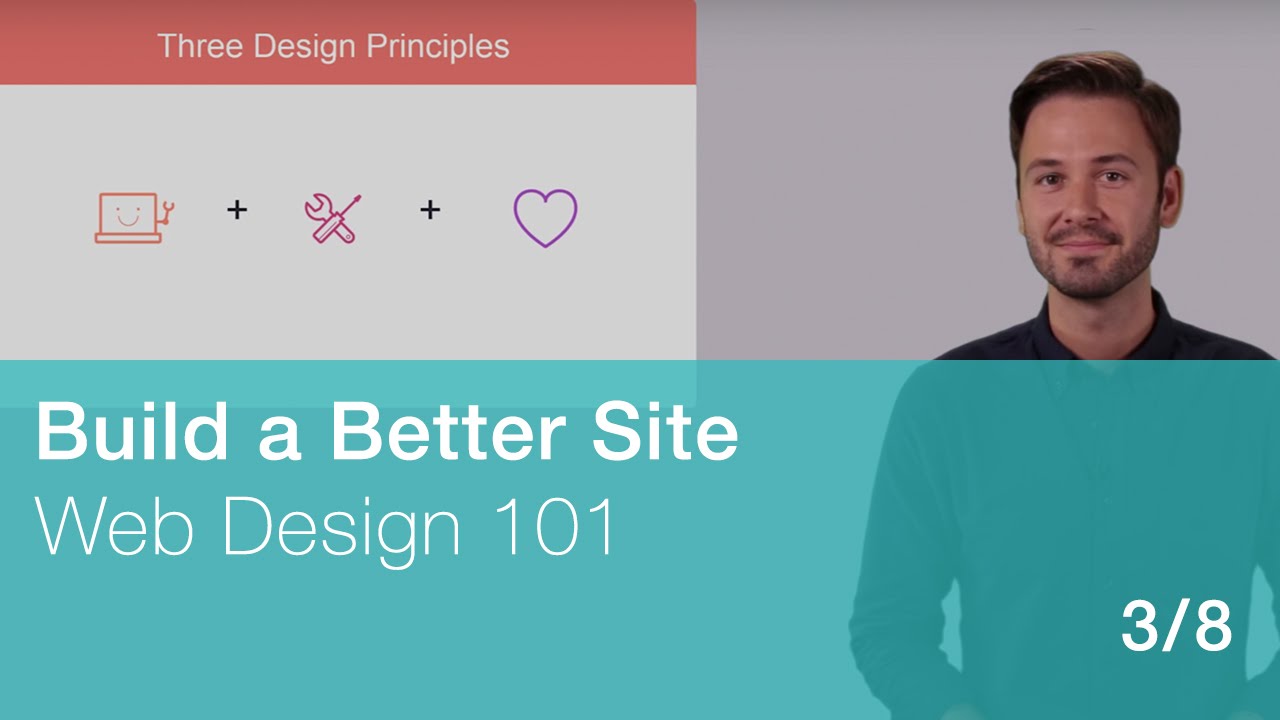
In this video, learn the three guiding principles of design. You don’t need to be a graphic or web designer to create an impressive website. Use this class as a resource to help guide you in your customization process, to make your website look and feel as good as it can. You’ll learn basic web design concepts and principles, to make the best design decisions for your site.
Sign up for WixEd at http://www.wixeducation.com to get downloadables for this lesson.
Also, subscribe to our channel here: https://goo.gl/d0VmxW
TRANSCRIPTION:
These principles or guidelines come from decades of observing how people interact with websites. Whether you’re creating a website for your cousin’s lemonade stand, your local community center or a Fortune 500 company – these same principles can and should guide your design decisions.
First and foremost – a well-designed website is EASY TO USE. This is also referred to as “user-friendliness”.
Second, well-designed websites actually WORK. They provide a purpose or a function.
Last but not least – the best websites make an impression. They’re visually IMPACTFUL, inspiring or even beautiful.
Now let’s walk through each principle a little closer.
The first rule of thumb for creating successful websites, is making them easy to use. Let me explain.
Think about what it’s like to visit a website for the first time.
Maybe you recently bought something from a new brand you just heard about, or wanted to look up what a certain company does.
What was the experience like?
How easy was it to find what you were looking for on the website?
Did you feel disoriented, lost in a maze?
Or, was it easy to navigate, with a familiar layout, where everything was clearly labeled?
Think about this when browsing the web, and you’ll start to appreciate sites where the design was PLANNED…and sites that AREN’T that user-friendly.
Now imagine someone visiting YOUR website for the first time. In other words, look at the project from the point of view of your POTENTIAL VISITORS. If you can focus on THESE people, you can make smarter design decisions. You’ll plan things based on their needs and expectations.
I can’t stress this principle enough: the website must be comfortable for visitors to find what they came for. We’ll look at some tips for user-friendly web design in the next chapter.
The second core design principle involves the way your site actually WORKS, and what it allows visitors to DO.
Think about the needs of your website visitor – and design your website around those needs.
For example, if I’m building a website for a pre-school, I want the parents to be able to find information about upcoming events and ways to get in touch with the staff. If I’m building a website for a band, I want it to be easy for fans to listen to samples, check upcoming shows and book tickets.
We’ll explore tips for optimal website functionality in a later chapter.
Finally, good web design inspires some sort of emotional response. This area is the most challenging to define, and different industries have very different notions of what looks good.
You may wish to create a warm and playful mood on your website, while others may want a more traditional, polished look. No matter what “mood” you are going for, the “design elements” of your site should support that mood. These include the colors and fonts you choose for your site. We’ll go into detail about these elements in a later chapter.
So there you have it – three core principles to inform your design decisions.
In the next three videos I’m going to walk you through some tips and best practices for APPLYING each principle, so we’ll transition from a theoretical discussion, into a more practical one.
Let’s do this!