

There’s a lot that goes into creating a web design, but I believe it can be broken down into four main components. If you’re able to execute on all four, you will have a hit web design on your hands. However, if you come up short on one, the entire design will suffer. That’s the challenge. All aspects of a great design must complement each other while helping achieve the end goals of the website. In this article, I’ve broken down the four key components of a great web design with examples and resources.
1. A Solid Layout
The importance of having a good foundation applies to just about everything in life. If the foundation is wrong, everything that is put on top of it will probably fail. In web design, the foundation is your layout. Laying out a web design involves placing all the content and navigational elements. You want to establish a hierarchy in these elements that gives the most important one’s prominence, and this should be determined by how you think your audience will use the site.
Use Wireframes
A common practice by web designers to nail down a layout is to create a wireframe, which is basically a bare-bones representation of the various elements that will appear on the page. Wireframes are typically made up of grayscale boxes and blocks of placeholder text. The key is to keep things simple and not get caught up in color and design elements.
Jesse Bennett-Chamberlain of 31Three is great about posting his design processes on his blog. Here is an example wireframe he created for the Embrace Pet Community project.
Be Generous With Whitespace
One key aspect of a great layout is more about what’s in between (or rather not in between) your various page elements. I’m talking about whitespace or negative space. Many designers make the mistake of over crowding their web designs. Don’t be afraid to let your pages breathe. Adding larger amounts of whitespace will actually give your design a more sophisticated look.
With so much going on in the layout of The Swish Life, Liam McKay realized how important it was to use wide margins around the content to give this design an open and airy feel while making it easy to skim over all of the text. Notice how much empty space is around the blocks of content. This makes it easier for the user to focus in on what’s important.
Mutant Labs is another great example of good use of whitespace. It gives this dark design an open feel and lets the subtle chalkboard texture and doodles room to show through.
Learn More About Layout And Wireframes
Wireframes Magazine is a blog written by information architects and interaction designers that has lots of info and examples of layouts and wireframing.
2. Effective Typography
Just like layout, typography plays an important role in how a user digests the content of a website. It’s important for a web design’s typography to be easy to read and follow while establishing structure and hierarchy within the content.
Big = Important
31Three uses all caps and a large font size for the titles and subtitles. This establishes a clear hierarchy that distinguishes the headings as having more importance than the paragraph below.
Make It Legible
By using high contrast between the text and the background, Dan Cederholm made the text on Simple Bits very easy to read. Also notice the amount of line spacing used in the paragraphs. Always make sure to use enough to make a body of text easy to read. This normally requires some experimentation, but a good rule of thumb is to set the line height to 1.5em, which is 1.5 times greater than the font size.
Learn More About Typography
If you want to learn more about typography, we’ve compiled a list of great sites about the subject, and we’ve also go a list of tools to help you with typography on the web.
3. The Right Color Scheme
Choosing the right color scheme is extremely important, because it will set the mood of your design more so than any other component. Don’t let your own personal taste determine what colors you use. That should be based on what’s trying to be achieved with the site and what you know about it’s audience.
Dare To Be Different
The Gap Medics site features a bold choice of colors that goes against everything we are used to seeing on medical related sites. It’s appropriate since the site is trying to attract young medical students. The colors help give the site a young hip feel that softens the seriousness of the subject matter.
Sometimes Little Color Is The Right Color
Carsonified basically only uses two colors. The dark brown and a creamy white compliment the vintage poster style and design elements. Sometimes a minimal color palette is all you need.
Need Help Choosing The Right Color Scheme?
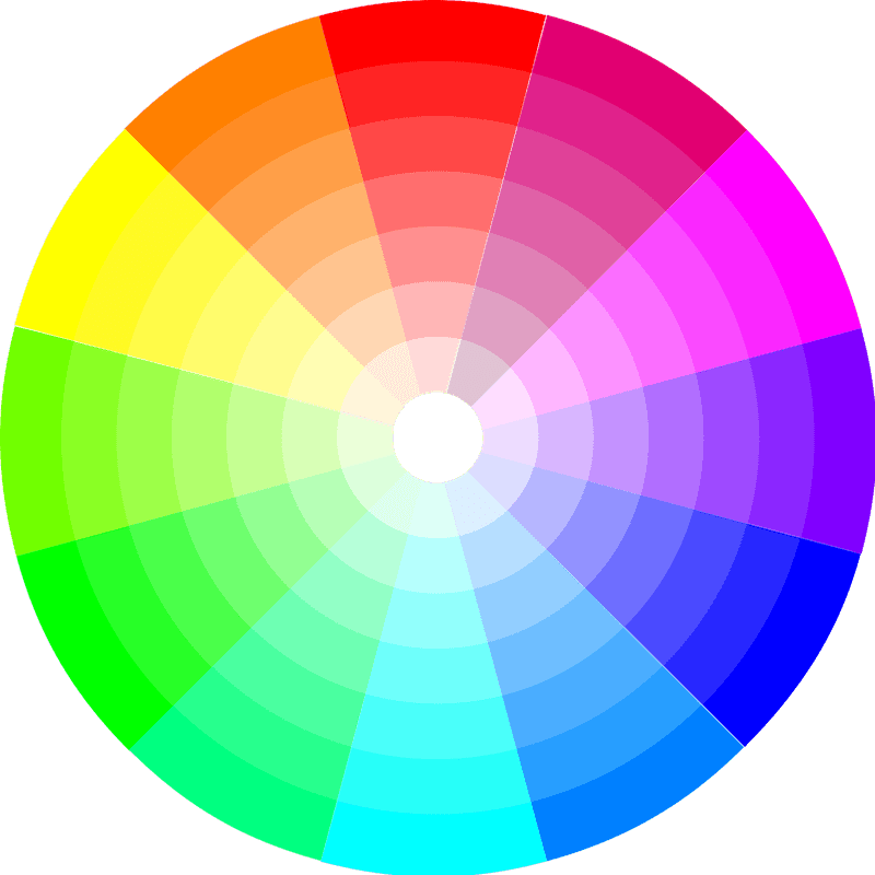
Adobe’s Kuler is a community-driven web app that lets your browse color palettes created by others. You can also create your own by using the color wheel, harmony rules, and color sliders. There are also other tools to help you choose the right colors.
4. Appropriate Design Elements

This is where you can have a lot of fun with a design. Your creativity can go wild here with texture, icons, patterns, etc. However, keep in mind that design elements also play a big role in setting the mood of the design. So keep things consistent with the goals of the website and it’s audience. Also keep the design elements consistent with the other three components we’ve already mentioned.
Consistency In Action
The designer of Red Velvet Art did an excellent job of utilizing the same hand-drawn style throughout the various design elements. Notice how the icons, background pattern, and doodles all work together. The consistency also flows through to the typography and retro color scheme.
Attention To Detail
The Squarespace blog has a typical blog layout and an overall clean design, but notice the pixel-perfect tick marks that line the left and right borders of the content area. It’s such a minimal design element, but it serves it’s purpose in establishing the focus on the content while staying consistent with the rest of the design.
Less Really Is More
This design could have worked well on a white background, but Elliot Jay Stocks loves using texture. To stay consistent with the open feel of the site, he went with a light and subtle grunge texture. It works because it doesn’t take away from the minimalism of the layout and still adds another layer of interest to the design.