Fundamentals #9: Responsive Design
Fundamentals #9: Responsive Design
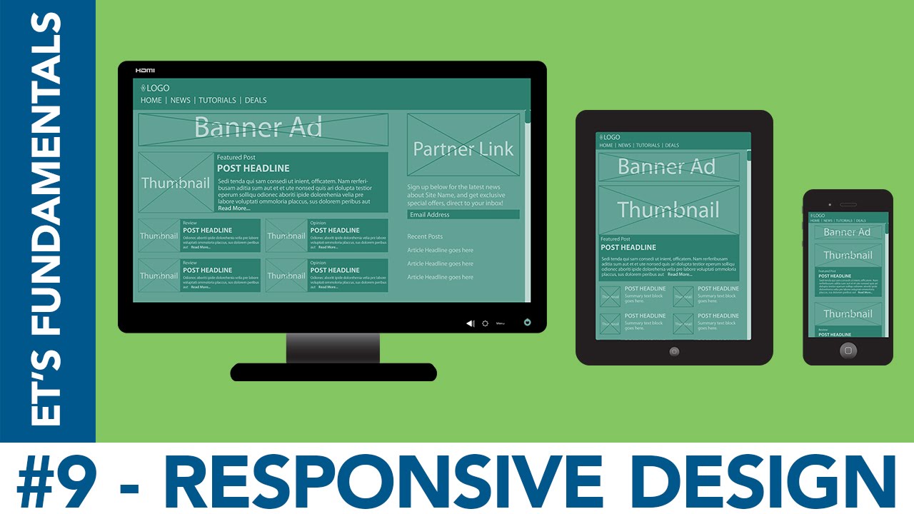
Any time you change your browser’s size or look at the same site on different devices, you’ll typically see the site change how it’s laid out. This is called responsive web design, and today’s Fundamentals video goes over how to do it.
List of media query features – https://developer.mozilla.org/en-US/docs/Web/CSS/@media
To learn literally anything you could ever need about code, if not design, check out the w3schools site, by the people who decide how the internet works – http://www.w3schools.com/
I’m planning on doing a new tutorial every Friday. Designing, programs, techniques and tricks I’ve picked up, and more will be covered.
If you like what I’m doing, subscribe for more! http://bit.ly/1Ylj8ZY
Follow me online!
Portfolio Site: http://bit.ly/1TPlUnA
Etsy: http://etsy.me/1XfIlQu
deviantART: http://bit.ly/1UW5cSD
Want to learn more?
How-To Playlist: http://bit.ly/1RC67lV
My A/V Works: http://bit.ly/1QKj3K1
Fundamentals List: http://bit.ly/21l4EWh
Credits:
Theme Music:
Achilles – Kevin MacLeod (incompetech.com)
Licensed under Creative Commons: By Attribution 3.0
http://creativecommons.org/licenses/by/3.0/
Video Music:
Rocket – Kevin MacLeod (incompetech.com)
Licensed under Creative Commons: By Attribution 3.0
http://creativecommons.org/licenses/by/3.0/
© Eric Thomas Studios