First, we need to define the meaning of the term “good design”. So, there are two important aspects. It should attract attention as well as please the eye of the beholder and it must serve a purpose (that is, to convey the message). Nowadays, free design programs can be found online, but to produce a good design it is necessary to know certain rules that every designer uses while designing his visuals.
To improve your design skills, we bring you 8 basic rules for good graphic design.
#1 KISS
KISS has become a well-known principle that graphic designers apply to their layouts ever since. Keep it simple, stupid – is a phrase that was coined by Kelly Johnson, lead engineer at the Lockheed Skunk Works, in 1960. The principle’s meaning isn’t difficult to understand and very similar to “less is more”. Don’t overcomplicate your design, keep it simple.
A clean and simple design is focused on the audience. With short attention spans and immense overflow of information, it’s necessary to be clear in your message. With this in mind, go to your layout and eliminate everything that’s not necessary. For example, more than three colors, more than two or three fonts, design elements that don’t transport any message at all or break a long text into paragraphs. Every design element needs to serve a purpose. Ask yourself if you need the element to understand the design.
Further to this, we come to the following rules, which will better explain how and why simplicity is essential.
#2 WHITE SPACE
The most important factor of good design is white space, or also called negative space. White space is the space between the elements in your design. Space that is not filled with text, graphics or photos. White space doesn’t have to be white. It can be a colored background or textured, as long as it doesn’t hold elements of design or content. Almost every designer faces the same problem – disagreement with the client about white space. While a designer knows about the advantages of negative space inside a layout, the client often feels like he’s not getting what he paid for. For the client, white space equals lost space. For the designer, white space is the rule of good design.
Clients usually require that every space is filled with information and elements. That makes it difficult to read, not enough emphasis is placed on what matters, and overcrowded visuals usually result in messages not reaching people. Try to avoid this situation. Suggest creating paragraphs and separating text through headings and subheadings in order to increases the readability of content and makes it easily scannable. The reader doesn’t have to search for important information because it stands out in your design. By leaving space around text and graphic elements, you not only create a hierarchy of those, but you can also put the main focus on the most important.
Below is a good example of a clean and simple design. The main message has been conveyed, and with this approach, people will be intrigued to visit our website to find out all the details.

So, don’t be afraid to leave the spaces empty. This doesn’t mean your design is boring or unattractive. Putting too much into your design can confuse the viewer. An overload of information can distract from what is important and makes people turn away. We suggest that once you get the brief from the client, spend a couple of minutes thinking about what the information is essential to provide, and what message is important to send. Make one object of your design stand out from the rest. This is the main focal point, and to make this obvious to the viewer it should be separated into other objects through negative space.
#3 RULE OF THIRDS
Understanding the rule of thirds in design is relatively simple, and can make you a significantly stronger designer. So, how the rule of thirds works?
Using grid in your layout, divide it into three equally sized horizontal sections and three equally sized vertical sections, the resulting grid provides a sort of “roadmap” that helps you choose where to place your design elements. You will end up with 9 fields, and the spots where the lines intersect indicate the prime focal areas within your design. Bringing an element closer to one of these intersections will allow it to stand out more, while objects that are further away will receive less attention.
In the example below, you can see the orange point that shows where the lines intersect and where is the prime focal areas. We can see the computer screen placed on the left side and aligns with the upper grid. With that, we determined what the focus would be.

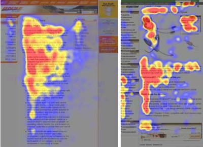
Audiences tend to follow a capital “F” shaped pattern with their eyes whenever they look at a design. The eye naturally starts at the top left section of the canvas, then moves down to the bottom left, back up to the top right, and then finally the bottom right.
The rule of thirds grid gives you the chance to give your graphic design a perfectly symmetrical appearance—but you’ll want to squash that instinct. The truth is that humans are naturally attracted to symmetry. While symmetry isn’t always necessary for good …